SlidePicker#
Basic SlidePicker
Inherits: LayoutControl
Properties
-
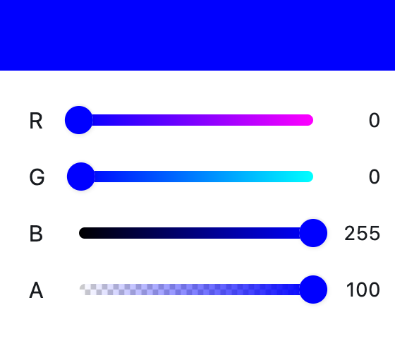
color(ColorValue | None) –The currently selected color.
-
color_model(ColorModel | None) –The color model used by the sliders.
-
display_thumb_color(bool) –Whether to display the thumb color in sliders.
-
enable_alpha(bool) –Whether to enable alpha (opacity) slider.
-
indicator_alignment_begin(Alignment | None) –Alignment for the indicator split begin.
-
indicator_alignment_end(Alignment | None) –Alignment for the indicator split end.
-
indicator_border_radius(BorderRadiusValue | None) –Border radius for the indicator.
-
indicator_size(Size | None) –Size of the indicator.
-
label_text_style(TextStyle | None) –Text style for labels.
-
label_types(list[ColorLabelType] | None) –Color label types to display.
-
show_indicator(bool) –Whether to show the color indicator.
-
show_label(bool) –Whether to show labels.
-
show_params(bool) –Whether to show parameter values.
-
show_slider_text(bool) –Whether to show slider text.
-
slider_size(Size | None) –Size of the sliders.
-
slider_text_style(TextStyle | None) –Text style for slider text.
Events
-
on_color_change(ControlEventHandler[SlidePicker] | None) –Called when the picker color is changed.
Example#
Properties#
class-attribute
instance-attribute
#
color: ColorValue | None = None
The currently selected color.
class-attribute
instance-attribute
#
The color model used by the sliders.
class-attribute
instance-attribute
#
display_thumb_color: bool = True
Whether to display the thumb color in sliders.
class-attribute
instance-attribute
#
enable_alpha: bool = True
Whether to enable alpha (opacity) slider.
class-attribute
instance-attribute
#
indicator_alignment_begin: Alignment | None = None
Alignment for the indicator split begin.
class-attribute
instance-attribute
#
indicator_alignment_end: Alignment | None = None
Alignment for the indicator split end.
class-attribute
instance-attribute
#
indicator_border_radius: BorderRadiusValue | None = None
Border radius for the indicator.
class-attribute
instance-attribute
#
indicator_size: Size | None = None
Size of the indicator.
class-attribute
instance-attribute
#
label_text_style: TextStyle | None = None
Text style for labels.
class-attribute
instance-attribute
#
label_types: list[ColorLabelType] | None = None
Color label types to display.
class-attribute
instance-attribute
#
show_indicator: bool = True
Whether to show the color indicator.
class-attribute
instance-attribute
#
show_params: bool = True
Whether to show parameter values.
class-attribute
instance-attribute
#
show_slider_text: bool = True
Whether to show slider text.
class-attribute
instance-attribute
#
slider_size: Size | None = None
Size of the sliders.
class-attribute
instance-attribute
#
slider_text_style: TextStyle | None = None
Text style for slider text.
Events#
class-attribute
instance-attribute
#
on_color_change: ControlEventHandler[SlidePicker] | None = (
    None
)
Called when the picker color is changed.
The data property of the event handler argument contains
the color value as a hex string.